Dashboard
The dashboard of the Energy Transition Model is an overview at the bottom of the page containing the most essential performance indicators of your scenario. You can click on each of the indicators in the dashboard to view the corresponding chart and more detailed information. By clicking 'Change' at the bottom right of the dashboard you can customize the dashboard. This page defines the performance indicators used within the dashboard.
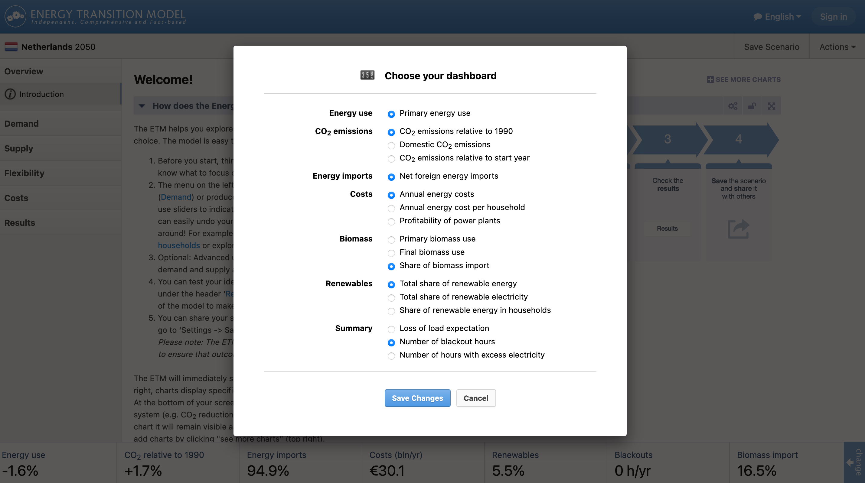
Energy use
Primary energy use
The percentage under ‘energy use’ on the dashboard shows difference in total primary energy consumption between the present and the future (based on your scenario). This includes all types of energy and non-energy consumption (e.g. natural gas consumption for fertilizer) within the ETM. Primary energy consumption as a result from exports is not included. This means losses incurred in the conversion sector before exporting energy are excluded.
Checkout: the Primary demand infopage for more information.
CO2 emissions
This category contains 3 dashboard items that only include CO2 emissions and 1 dashboard item that includes all greenhouse gas emissions.
CO2 emissions relative to 1990
This percentage shows the change in CO2 emission between 1990 and the final year of the scenario. The chart shows the CO2 emissions in 1990, in the present year and final year. CO2 emissions shown here are the total energetic CO2 emissions resulting from the total final energy consumption. This does not include CO2 emissions from non-energy consumption, exports, fugitive emissions, industrial processes, solvents and other product use, LULUCF, and other. It does include the CO2 emission reduction due to CO2 capture and storage and the emissions from feedstock.
Domestic CO2 emissions
Percentage difference in energetic CO2 emissions due to final energy consumption between 1990 and the scenario year, excluding the CO2 emissions of imported electricity, hydrogen and heat and including emissions of exported electricity, hydrogen and heat.
CO2 emissions relative to start year
This percentage shows the change in CO2 emission between the starting year and final year of your scenario. The scope and chart are similar to CO2 emission relative to 1990.
Total greenhouse gas emissions relative to start year
This percentage shows the change in total greenhouse gas emission between the starting year and final year of your scenario. The accompanying chart distinguishes between energetic CO2, non-energetic CO2, energetic other greenhouse gases, non-energetic other greenhouse gases and indirect and delayed CO2 emissions.
Checkout: the Emissions infopage for more information on definitions and calculations.
Energy imports
Net foreign energy imports
The percentage shows the amount of imported primary energy (imports - exports) compared to the total primary energy consumption. In this case conversion losses due to export are included in the total primary energy consumption (a ‘territorial’ approach). The chart shows the total amount of energy import as a result of the total energy import of different types of energy carriers for the present and final scenario year.
Checkout: the 'Energy Imports' infopage in the Dashboard section for more information.
Costs
Annual energy costs
The number shows the total yearly cost of energy supply for your scenario. The chart displays the costs for the present (left) and final scenario year (right) composed of the costs for different types of energy production.
Profitability of power plants
The percentage on the dashboard shows which percentage of the installed dispatchable power production capacity is economically viable. This table shows (of all plants, not only the dispatchable plants) what plants are profitable or unprofitable in your scenario. For more information about the table, please visit 'Economic viability of assets' .
Biomass
Primary biomass use
The primary biomass use item within the dashboard explains the total amount of primary available energy in wet biomass, dry biomass, oil-based biomass or biogenic waste. The chart shows the total bio resource demand within your region and relates the demand to the potential of each bio resource category.
Final biomass use
The final biomass use displays the total amount of final energy produced due to the usage of biomass. The final biomass is calculated by subtracting the energy losses when using biomass to produce energy from the total primary biomass use.
Share of biomass import
The total share of biomass import is the amount of imported biomass (in joule) compared to the of the total amount of primary biomass use. The amount of biomass that is imported from outside your region is defined by looking at the total potential of biomass within your region compared to the total demand of biomass. The Sankey-diagram attached to this dashboard item displays this difference.
Checkout: the 'Biomass' infopage for more information.
Renewables
Total share of renewable energy
The number shows the percentage of final energy consumption that is supplied by renewable sources in your scenario. The chart shows the percentage for the present year and final scenario year.
Total share of renewable electricity
The percentage of final electricity consumption that is renewably produced.
Share of renewable energy in households
The percentage of final energy consumption in households that is renewably produced.
Checkout: the 'Renewables' infopage for more information.
Summary
Loss of load expectation
The loss of load dashboard item shows the number of hours in which the capacity for electricity production is expected to be less than the demand. It is calculated by comparing the peak electricity demand with the total installed capacity. The variability of volatile electricity production (i.e. Solar PV and wind turbines) is also taken into account. The graph displays the peak electricity demand compared to the installed electricity production for the present and future. The electricity production capacity is split into volatile production, which is unreliable, and dispatchable production, which is reliable. To avoid a loss of load it is important that there is sufficient reliable electricity capacity to meet the peak electricity demand.
Checkout: the 'Loss of load' infopage for more information.
Power shortage
This dashboard item shows the number of hours per year during which a power shortage occurs. Power shortages occur when electricity supply is insufficient to meet electricity demand and when it is not possible to fill this gap with electricity import or flexible technologies such as electricity storage. The ETM calculates power shortages on an hourly basis. The table shows information about the volume, peak capacity and duration of power shortages in a scenario.
Number of hours with excess electricity
As a result of large numbers of wind turbines and solar panels installed, the supply of electricity can be larger than the demand. The number of hours with excess electricity displays this event. If you include flexibility options in your scenario, the number of excess events decreases.
Check out: the infopages under 'Flexibility' for more information.